Storefront filtering UX guidelines
Storefront filtering is an essential component of the customer experience as it helps them find what they're looking for faster, which can help increase conversions for merchants.
The following outlines some key considerations related to the filtering experience.
To learn how to implement a basic version of storefront filtering, refer to Support storefront filtering.
Provide the right interface for each filter type
There are two filter types:
List
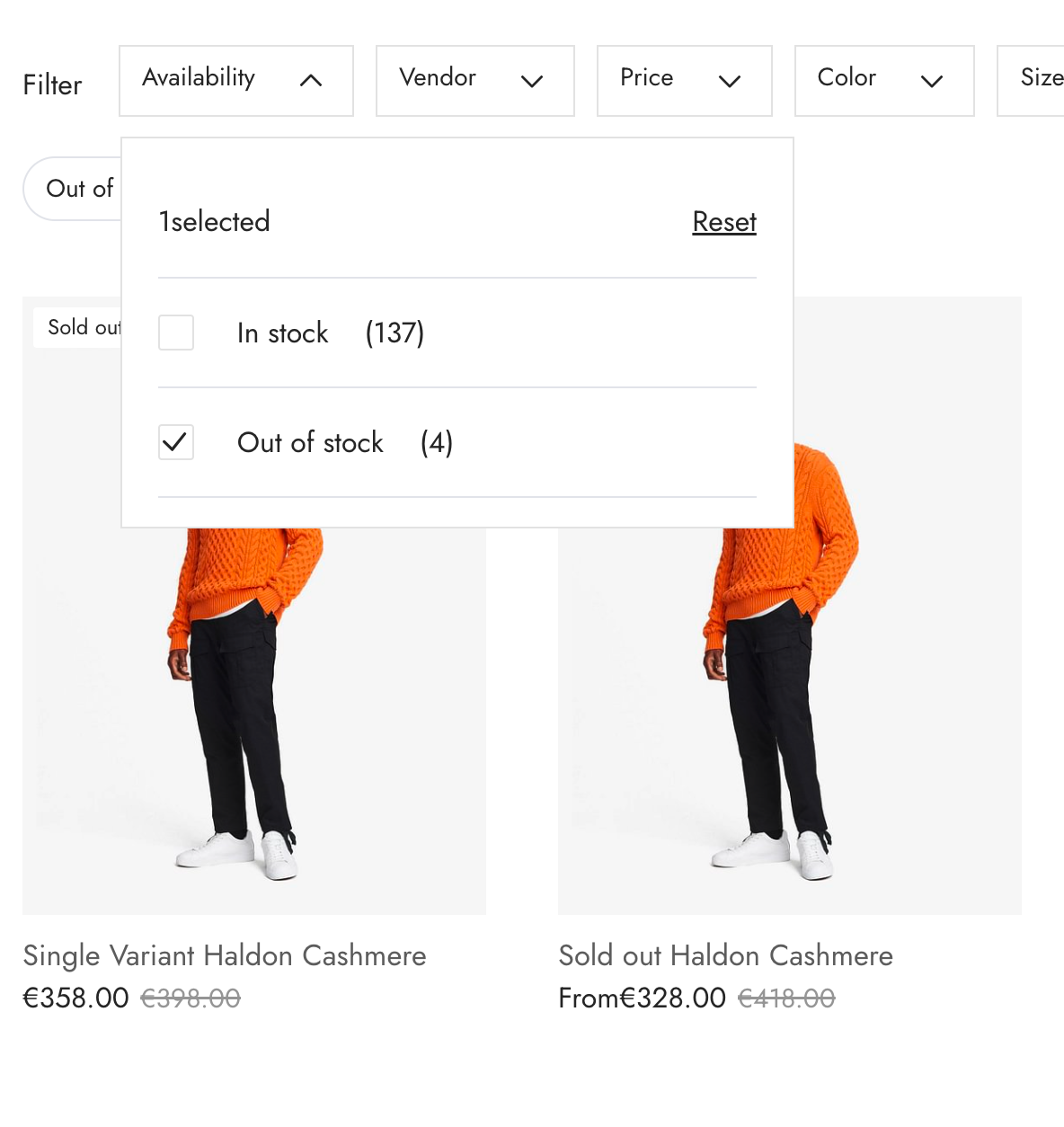
It's recommended to use a set of checkbox inputs for filters of type list to make it obvious that multiple values can be selected at once.
For example:

Price range
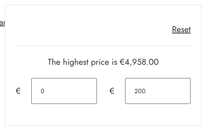
It's recommended to use a number input for filters of type price_range. You should ensure that the field number fields have labels, such as "From" and "To".

Provide a choice of filter layout
There are two standard layouts for filtering on larger screens:
- A horizontal toolbar above the product list
- A vertical sidebar to the left of the product list
In order to provide flexibility for varying merchant needs, you should consider providing both layouts as an option behind a theme setting.
Horizontal toolbar filters
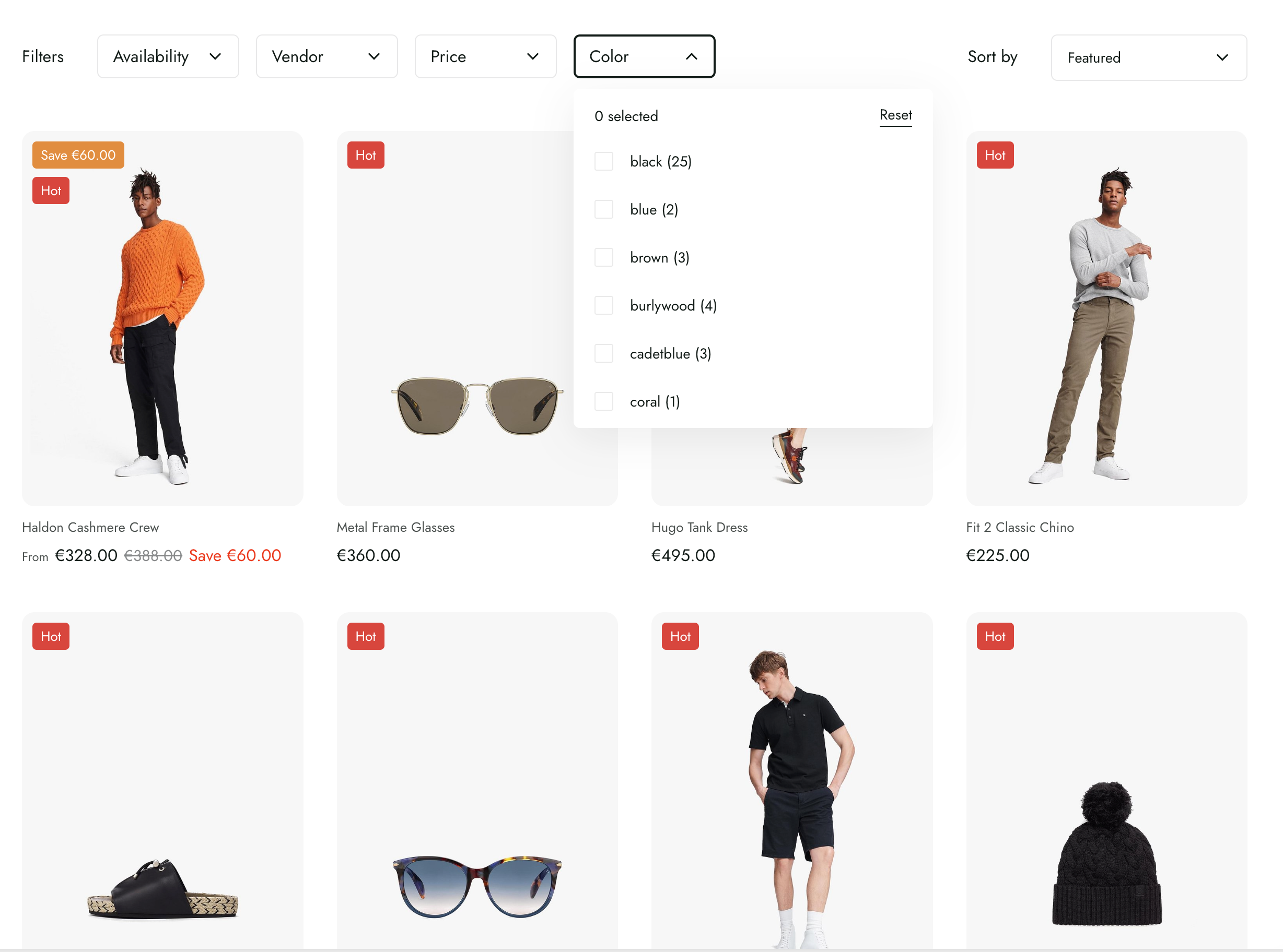
A horizontal toolbar above the product list can provide a compact entry point to both filtering and sorting but works best for smaller stores that need less than five filters at a time.
For example:

Vertical sidebar filters
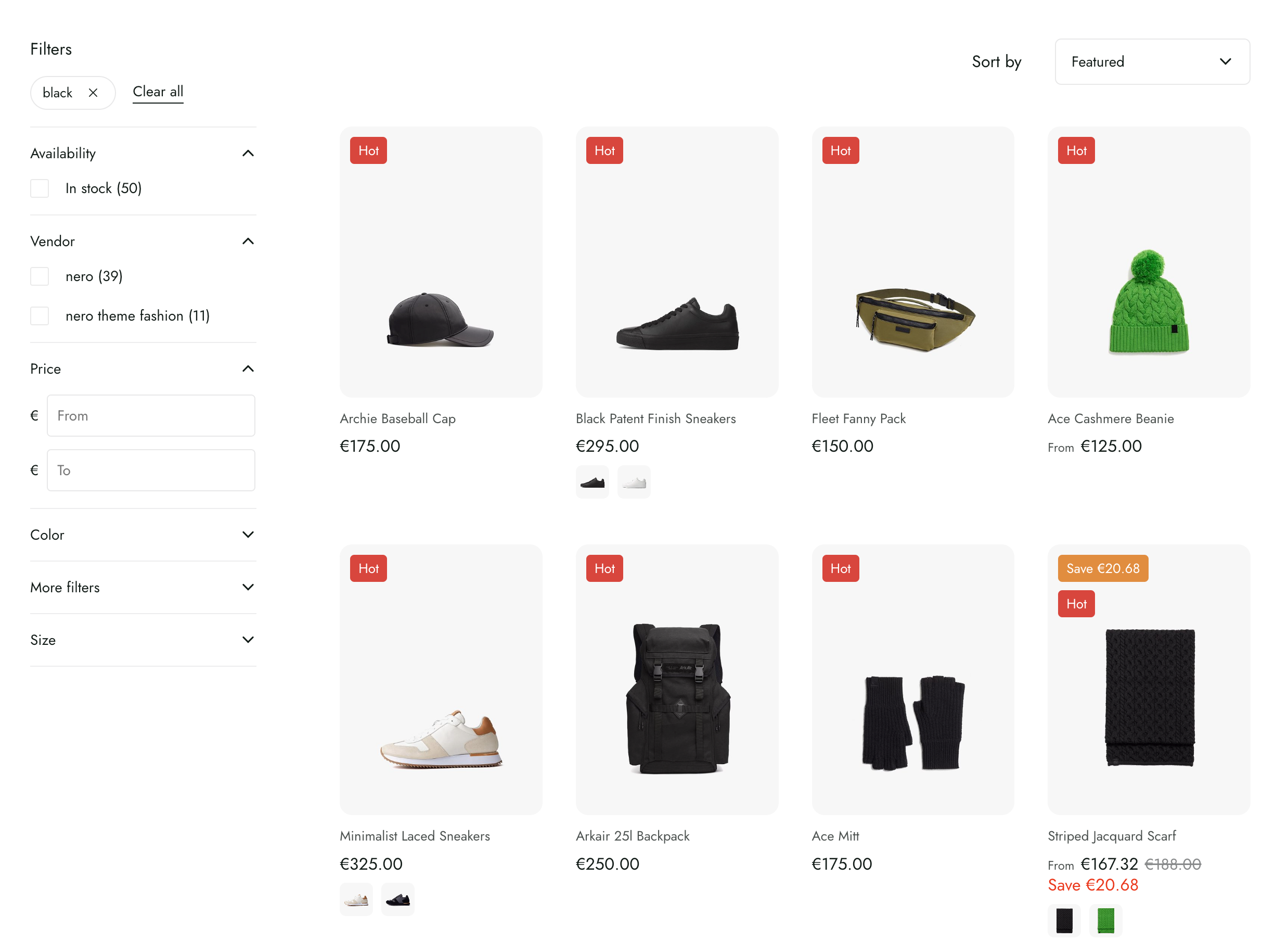
A vertical sidebar to the left of the product list works best for stores with more than five filters.
For example:

Updated almost 2 years ago
